Exploring the Use of Color in Mondrian's Art
Key Takeaways
- Piet Mondrian is known for his abstract art that utilizes a strict color palette and geometric shapes.
- He believed in using color theory to evoke feelings and create balance within an artwork.
- Understanding color harmony is essential in applying Mondrian's techniques to contemporary art practices.
- Art can transform spaces, as demonstrated in Mondrian's works that emphasize simplicity and clarity.
Piet Mondrian, a pioneer of abstract art, is renowned for his unique approach to color, form, and composition. Utilizing a limited palette primarily made up of primary colors, Mondrian's works are a testament to his belief in the emotional and intellectual power of color. In this article, we will delve into how Mondrian applied color theory in his artworks and how contemporary artists can draw inspiration from his methods.
Theoretical Background: Color in Art
Understanding color theory is crucial for artists aiming to create meaningful and engaging compositions. Color can impact mood, perception, and response to art. Below is a brief overview of color theory essentials.
| Color Type | Characteristics | Emotional Impact |
|---|---|---|
| Primary Colors | Red, Blue, Yellow | Bold, basic emotions, attention-grabbing |
| Secondary Colors | Green, Orange, Purple | Playful, vibrant, dynamic |
| Tertiary Colors | Red-Orange, Yellow-Green, etc. | Complex, sophisticated, inviting |
| Neutral Colors | Black, White, Grays | Calm, subdued, professional |
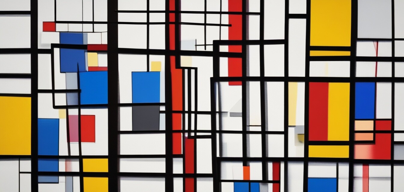
Piet Mondrian and His Color Palette
Mondrian reduced his color palette to the essentials: primary colors, along with black, white, and gray. This approach emphasized clarity and balance in his compositions. Let’s explore the components of his famous style:
- Red: Energy and passion.
- Blue: Calmness and reliability.
- Yellow: Happiness and optimism.
- Black: Strength and simplicity.
- White: Purity and space.
Applying Mondrian's Techniques
To implement Mondrian's techniques in your own art, consider the following principles:
- Limit your color palette to primary colors to create striking compositions.
- Focus on geometric forms—rectangles and squares—to create a sense of structure.
- Use black lines to divide sections of color, enhancing the overall composition.
- Experiment with proportions of colors; a small amount of bold color can stand out against neutral backgrounds.
Featured Product: Mondrian Inspired Art Print
To bring a piece of Mondrian's minimalist style into your home, consider exploring art prints that reflect his techniques.
 Top Choice
ARTCANVAS Composition with Red, Blue, and Yellow Canvas Art Print
Hand-crafted with vibrant, long-lasting colors, this piece captures Mondrian's essence and will transform your space.
Learn MoreThe Influence of Color on Space
Mondrian's art is not just about aesthetics; it's about how color influences perception and the atmosphere of a space. By understanding his principles, artists can manipulate color to create different ambiance in their work.
Case Study: Color in Interior Design
Just as Mondrian did with his canvases, interior designers can use color to evoke feelings in different rooms. Here’s how:
| Room | Color Palette | Intended Emotion |
|---|---|---|
| Living Room | Neutral with Bold Accent | Inviting and Comfortable |
| Bedroom | Soft Blues and Whites | Calming and Relaxing |
| Home Office | Yellow and Gray | Inspired and Productive |
Conclusion
The exploration of color in Mondrian's art is a valuable lesson for today’s artists. His emphasis on simplicity, structure, and emotional impact can guide you in your creative endeavors. Understanding color theory not only enhances your work but also allows you to engage your audience more deeply. Implement the strategies discussed here and unleash your unique expression through color!
Further Resources
If you want to dive deeper into understanding famous artists and their techniques, check out our resources on:
- Pablo Picasso
- Vincent van Gogh
- Salvador Dalí
- Leonardo da Vinci
- Michelangelo