The Color Theory of Piet Mondrian
Key Takeaways
- Piet Mondrian emphasized the use of primary colors and geometric shapes in his compositions.
- The artist's work reflects a movement towards abstraction and clarity in art.
- Contemporary artists can benefit from applying Mondrian's principles of balance and harmony in color use.
Piet Mondrian is a name synonymous with abstraction and a groundbreaking approach to color theory. Known for his iconic works that feature bold lines and primary colors, Mondrian's art extends beyond mere aesthetics; it embodies a philosophy of balance and harmony. In this article, we will explore Mondrian's approach to color theory and composition, and offer insights into how contemporary artists can apply these concepts to their own work for dynamic results.
Understanding Mondrian’s Color Theory
Mondrian believed that colors could evoke emotions and convey ideas. His art was structured, yet emotional, with a clear intention behind every choice of color and form. Here are some key principles of his color theory:
- Primary Colors: Red, blue, and yellow were central to Mondrian's color palette, representing the purest expressions of art.
- Non-colors: He often paired primary colors with non-colors like black, white, and gray to create contrast and balance.
- Geometric Forms: By using squares and rectangles, Mondrian created a dynamic interplay between color and structure.
The Use of Primary Colors
For Mondrian, primary colors were not just mere visual elements; they served as foundational blocks of his artistic vision. He applied these colors to express the essence of modern life.
Creating Visual Balance
The arrangement of colors and shapes in Mondrian's artwork was meticulously planned. Every piece aimed for a sense of balance and harmony, which can be observed in his composition techniques. Below is an example of how these elements work together:
| Element | Description |
|---|---|
| Color | Primary hues like red, blue, and yellow evoke strong emotions. |
| Line | Black lines define the structure, creating a grid-like appearance. |
| Form | Rectangular shapes interact with each other, guiding the viewer's eye. |
Applying Mondrian’s Color Theory Today
Modern artists can derive much from Mondrian's principles. Here are some tips to incorporate these ideas into your own work:
Tips for Contemporary Artists
- Experiment with primary colors and observe how they interact.
- Focus on the placement of shapes to create dynamic tension in your compositions.
- Use color contrasts to convey emotion or highlight specific elements within your art.
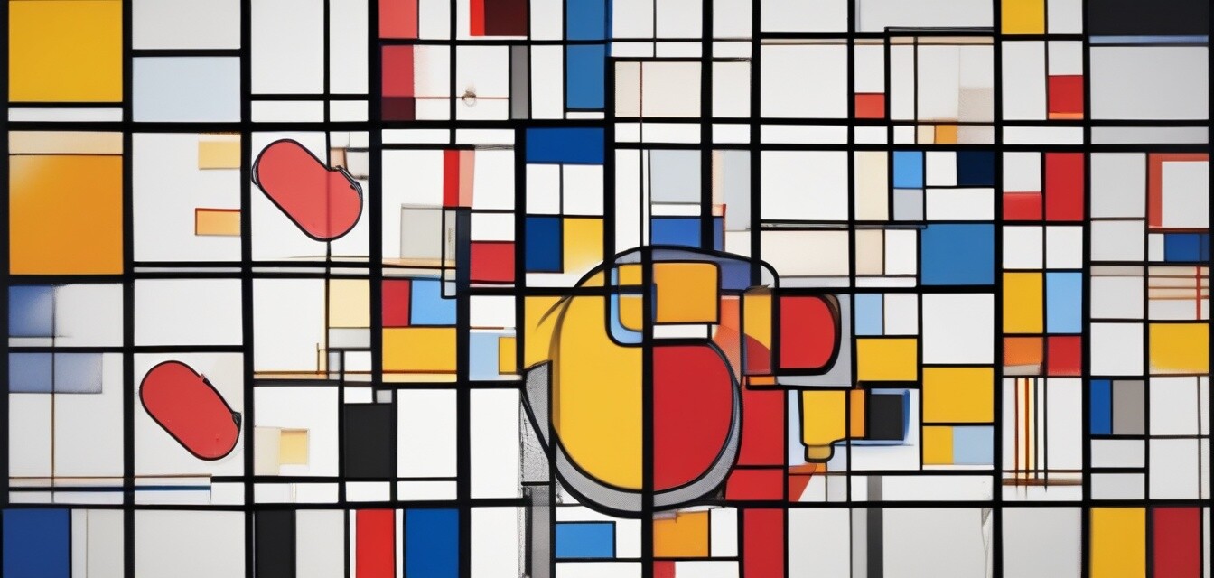
Case Study: Composition with Red, Blue, and Yellow
This iconic painting illustrates Mondrian's color theory beautifully. The strategic use of primary colors against stark black lines exemplifies how colors can create a visually compelling narrative. Let's take a closer look at this masterpiece:
 Artistic Masterpiece
ARTCANVAS Composition with Red, Blue, and Yellow Canvas Art Print
Hand-crafted using archival inks and artist-grade canvas, this piece is perfect for transforming your space with vibrant colors.
Learn MoreMondrian’s Influence on Contemporary Art
The influence of Mondrian on today's artists cannot be understated. His minimalist style has paved the way for various art movements, inspiring countless artists to explore the potential of colors and forms in their work. Artists like Henri Matisse and Pablo Picasso have incorporated elements of abstraction that resonate with Mondrian's aesthetic.
A Legacy of Modernism
Mondrian's work marks a significant shift in the art world, moving towards abstraction and social commentary. His approach to color theory serves not just as a method, but as an ideology promoting simplicity amidst complexity.
Conclusion
Piet Mondrian's exploration of color theory and composition establishes a timeless framework for artists. As we study his work and apply his principles, we renew our understanding of color's emotional weight and significance in art. By embracing the core concepts of Mondrian's artistry, contemporary artists can breathe new life into their creations and engage audiences on a deeper level.
Further Resources
To deepen your understanding of Piet Mondrian and other famous painters, check out our educational resources: